
More Than Pretty Colors: The Business ROI of Good UI Design
Many business owners treat color in software as a decoration choice. We explain why color theory is a critical functional tool that impacts usability, trust, and your bottom line.
Table of Contents
Expand
When we start a custom software project, the conversation always turns to design eventually. And a stakeholder will say something like “just make it pop,” or “purple’s my favorite, let’s use that.”
That’s a fundamental misread of what digital product design actually is. In software, color isn’t decoration. Color is function.
For internal dashboards or customer-facing portals, your color choices shape how people interact with the tool, how fast they work, and whether they trust the platform at all. We don’t pick colors because they look nice. We pick them because of what the application needs to do.
The “Body Language” of Software
Walk into a bank with neon orange walls and you won’t trust them with your money. You expect blues and greys. Colors that say “stable” before a single word is spoken.
Color is the body language of your application. Before a user reads one headline, the palette has already set their expectations.
The Psychology Beat
Skip the academic color theory. You only need the basics of the color wheel to avoid an expensive mistake.
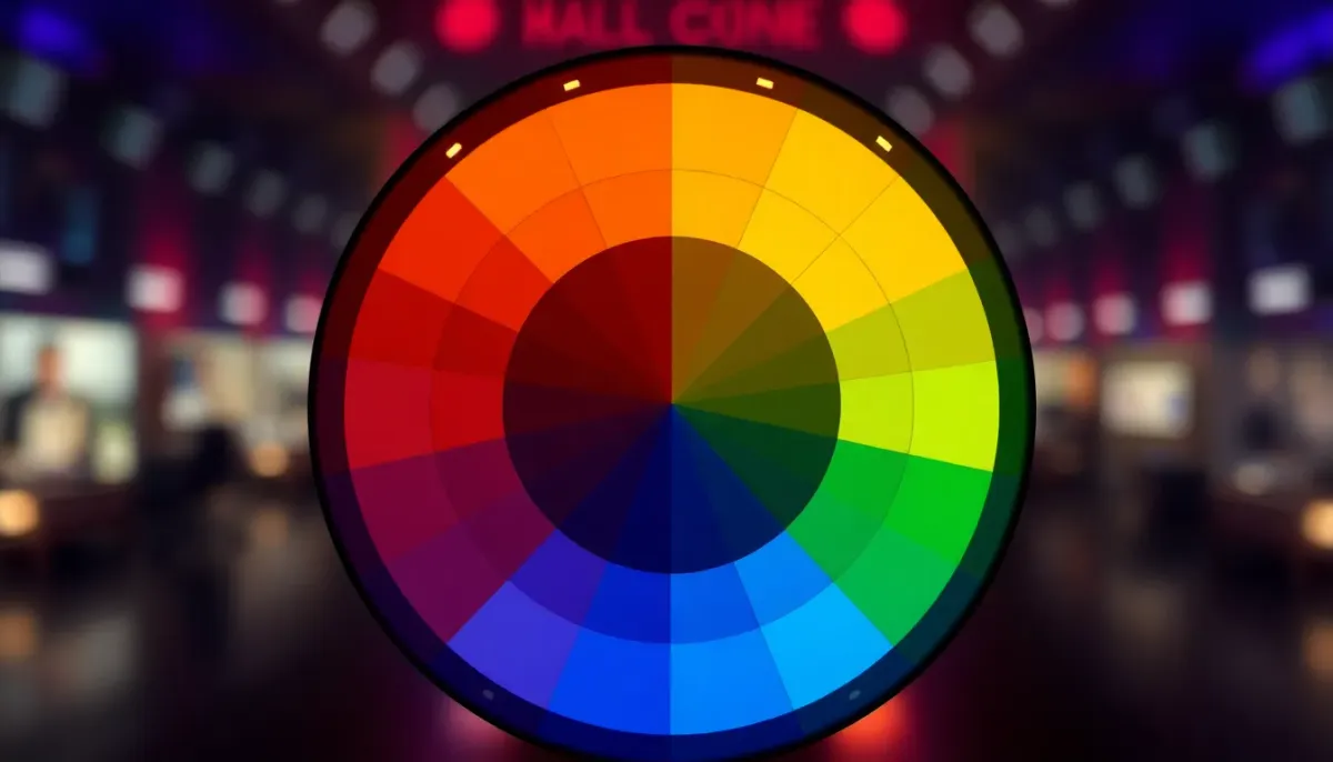
Cool colors, blues and greens, signal trust, security, calm. That’s why banks and healthcare portals lean on blue so hard. Warm colors, reds and oranges, signal energy and urgency. Save those for “Buy Now” buttons and critical error alerts, not everyday interface chrome.
Building an accounting platform? Skip the aggressive reds on the primary interface. They quietly make people anxious while entering data. Stick to palettes that promote focus.
The Functional Side: Contrast and Usability
This is where color theory stops being “art” and turns into engineering: accessibility. If your employees have to squint at grey text on a light grey background, you’ve already failed.
We follow the Web Content Accessibility Guidelines (WCAG). That guarantees mathematical contrast between text and background, so everyone, including users with visual impairments, can actually use the tool. Good design is about clarity. Not just looking nice.

How to Do It Right: The Strategic Approach
We use a disciplined, almost mathematical approach to palettes, so your application doesn’t end up looking like a bag of Skittles.
1. The 60-30-10 Rule
Sixty percent is your dominant color: the neutral background, whites, light greys, dark charcoals. This is the canvas. Thirty percent is your secondary color, used for headers, sidebars, major sections. Ten percent is your accent, reserved strictly for calls to action like “Submit” or “Save.”
Limit that accent color and you train the user’s eye exactly where to look next.
2. Semantic Colors (The Language of Status)
Your software needs a standardized traffic-light system, and you should never break from it. Green means success, complete, safe. Red means error, danger, delete. Yellow or orange means warning, pending, needs attention. Break these norms even once and you’ll confuse people who’ve learned to trust them.
The Business Impact
Professional, accessible color use raises trust and perceived value. For internal tools, a high-contrast palette cuts cognitive load, which means employees finish tasks faster and with fewer mistakes.
Don’t treat color as an afterthought. Treat it as a core part of your user experience strategy. Got a defined project ready for design? Use our fixed-price estimator to get started, or talk to us about a subscription partnership for ongoing software stewardship.

Related Topics
About Ryse Software
We are a software engineering partner that makes it easy for teams to design, build, and evolve custom software, from early experiments to long-term systems.
If this article was useful, and you’re thinking about software in your own business, we’re happy to talk through options and tradeoffs.
A clear discussion, no pressure and no pitch.